Problem Statement
How might we redesign The Ontario Cannabis Store logo to emphasize it’s crown corporation credibility and enhance its branding?
Solution
The redesigned Ontario Cannabis Store logo preserved the minimalistic look of the original branding. A simple cannabis leaf united with the Ontario government logo strengthens the visuals and the crown corporation credibility. The similar font style and colour are continuation of the original to help consumers make easy connections with the new branding. Factors on how the redesigned branding makes an impact:
• Simple, minimalistic design that’s easy to remember
• Incorporating the Ontario government logo to show credibility
• Cannabis leaf used in the logo reinforces the visuals of the branding
The original wordmark and the redesigned logo
Brand Research
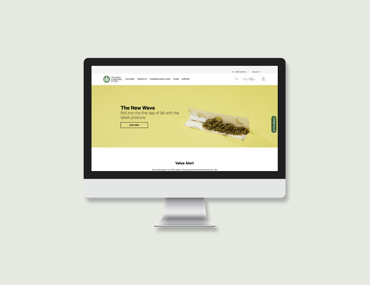
The Ontario Cannabis Store logo is designed by the Canadian subsidiary of Leo Burnett Worldwide. The store itself is a Crown corporation in Ontario, Canada that has a legal monopoly on the online retail and wholesale distribution of recreational cannabis to consumers and privately controlled brick and mortar shops. The original logo is a minimalistic design with the words OCS inside a circle. The main color of the logo is white, black, and green. The branding style guide of the OCS logo can be found on the Leo Burnett website. Since it’s a Crown corporation, it is reflected on the style of the logo with a clean, professional look.

User Research
To better understand the needs and qualities consumers look for, I conducted user research with interviews to determine some crucial factors. The interview consists of questions such as the reason they smoke, what branding qualities are they looking for in a brand, what brands/ stores have they purchased from before, and more. I gathered some key points from my interview sessions as following:

Smoke for relaxation and social reasons
The majority of consumers engage in smoking for the purpose of relaxation. This technique is an efficient way to reduce tension and anxiety. This practice serves as a means to alleviate stress and anxiety effectively. Additionally, smoking is frequently a social activity, often enjoyed in the company of friends during socialization.

Pre rolls or edibles are most popular
Pre-rolls, which are pre-made joints, are favored by individuals who appreciate the convenience, simplicity, and immediacy of smoking. On the other hand, edibles, which encompass a wide range of cannabis-infused food products, are preferred by those seeking an alternative and discreet consumption method. Edibles provide a smoke-free option, making them appealing to individuals who may have respiratory concerns or simply prefer not to smoke.

Prefers professional looking brands that are also welcoming and fun
Preference for stores that project a sense of dependability and quality assurance through their professional appearance. Professional appearances are valued because they are seen as symbols of quality and security, yet playful branding is appealing because it creates a lively and friendly environment.

Brands purchased before
• Grass Hut Cannabis Co.
• Cannabis GuysOntario
• Cannabis Store
Competitor Analysis & Visual Research
I conducted visual research on various cannabis stores and illustrations related to cannabis. Given that the OCS is a government-operated store, my focus was on exploring the branding of other cannabis stores in Canada. I observed that the majority of logos in this industry exhibit simplicity, characterized by clean lines or shapes, a minimalist aesthetic, and a prominent use of wordmarks.
Ideation Sketches
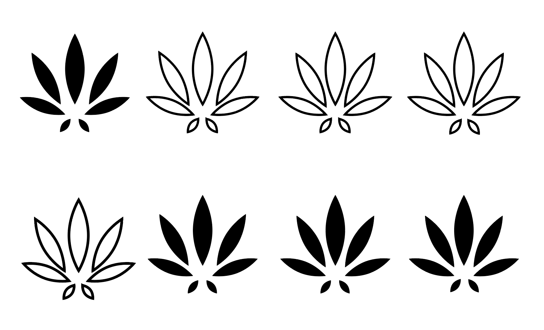
Following a thorough visual exploration, I initiated the ideation process by sketching various concepts on my iPad using Procreate. These sketches encompassed diverse styles, including minimalistic, realistic, and geometric approaches. The process of ideation was crucial in identifying a range of options for the logo's design.
Further Ideation
Exploring various cannabis visualization methods inspired my initial Illustrator logo concepts. I creates some quick ideas for further refinement. I explored different styles and line weight to determine what works. Since OCS is a crown corporation, I was inspired to incorporate the Ontario government logo into the OCS logo itself.
Decision Making
I decided to further refine the idea of combining the Ontario government logo and cannabis leaf. With this concept, the logo can remain simple yet shows the status of the company. My first instinct was to rotate the Ontario logo, but on second thought I think it would be inappropriate to alter the government logo. I steered away from that concept and focused on other design options. I explored various layouts and stroke weight of the Ontario logo.
Refine
Focusing on tweaking details of the logo, I developed iterations with slight changes to find the most suitable sizing of the leaf and thickness. I experimented with having the Ontario logo as filled or just a stroke. Having the Ontario logo as a solid fill worked the best. I made further refinements of enlarging the logo and smoothing the corners for a more sleek silhouette.
Final Branding
The final redesign of the OCS logo is a simple yet catchy concept that combines cannabis and the Ontario government logo. Through this change, the core product and the companies crown corporation status is effectively shown by the logo. The green colour was part of the original branding and is used to enhance the visualization. The logo can either be used with a fill or a no fill version.


Lessons Learned
Designing With
The challenge of redesigning a brand that was out of my interest broadens my perspective, particularly in areas I wouldn't typically engage with. Designing with empathy for this subject posed a unique set of problem, especially considering my past experiences and personal trauma related to cannabis. Initially, it was difficult for me to approach the design process with the required sensitivity. However, as the project progressed, I found the experience to be engaging and enlightening. It not only enhanced my design skills but also provided me with valuable insights into designing with empathy and aligning with the core values that consumers prioritize.
User Research
Conducting interviews made a great impact on the concepts I focused on. Since I wasn’t familiar with the cannabis industry, gathering and analyzing crucial factors from the consumers pushed the progress of the logo’s conceptualization. Without the research insights, I wouldn’t know what the consumer values and prioritizes when purchasing.